The Problem
In 2015, the two founders of Bink approached us (Clevertech) with the aim of building a prototype to take to investors. All they had was an idea and a 30-day turnaround time.
What I did
I was the sole UX/UI designer on the project and managed both the work and the client from the beginning. I held a remote discovery session with the founders to understand the value proposition to users and exactly what they required for the investor meetings.
- client discovery session
- content discovery
- sign-up flow
- red routes
- userflows
- wireframes
- UI
- Prototype build (inVision)
Success
Within 30 days, we had a functioning prototype, brand and website designed. The founders were able to show investors the working prototype as if it were live on their mobile device.
The work
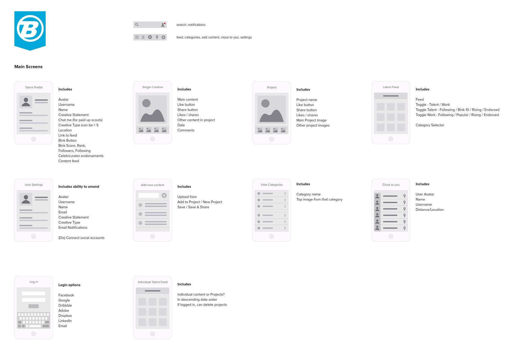
Main screen detail
After understanding the concept of Bink, I turned the founders thoughts to their two users types and their needs. I took them through a red route exercise and together we came up with the main screens for the app and the content that those screens needed.
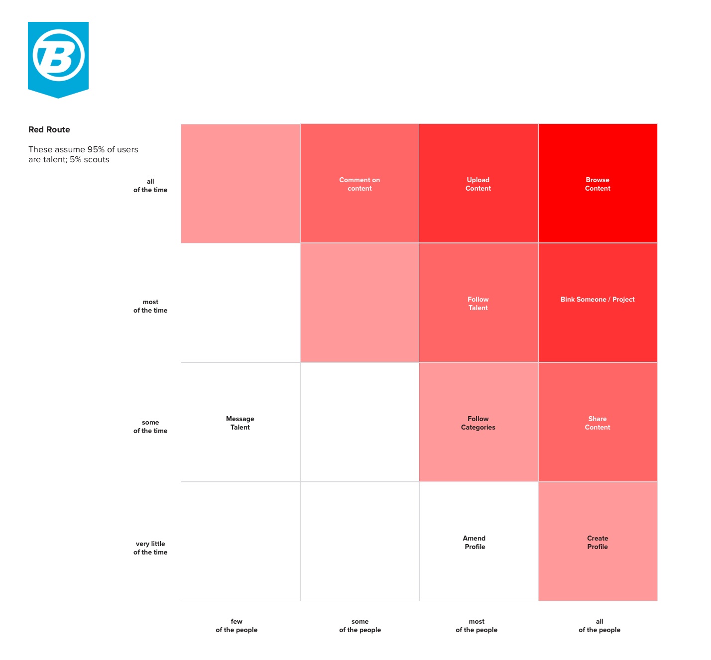
Red routes
Used to discover and prioritize the main features of the app, both for navigation and MVP purposes
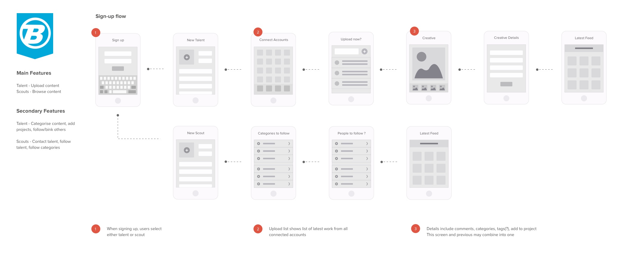
User Sign-up screens
Getting users signed up and on-boarded as quickly as possible is essential to a successful app. This flow ensured that both sets of users were able to sign up with little friction.
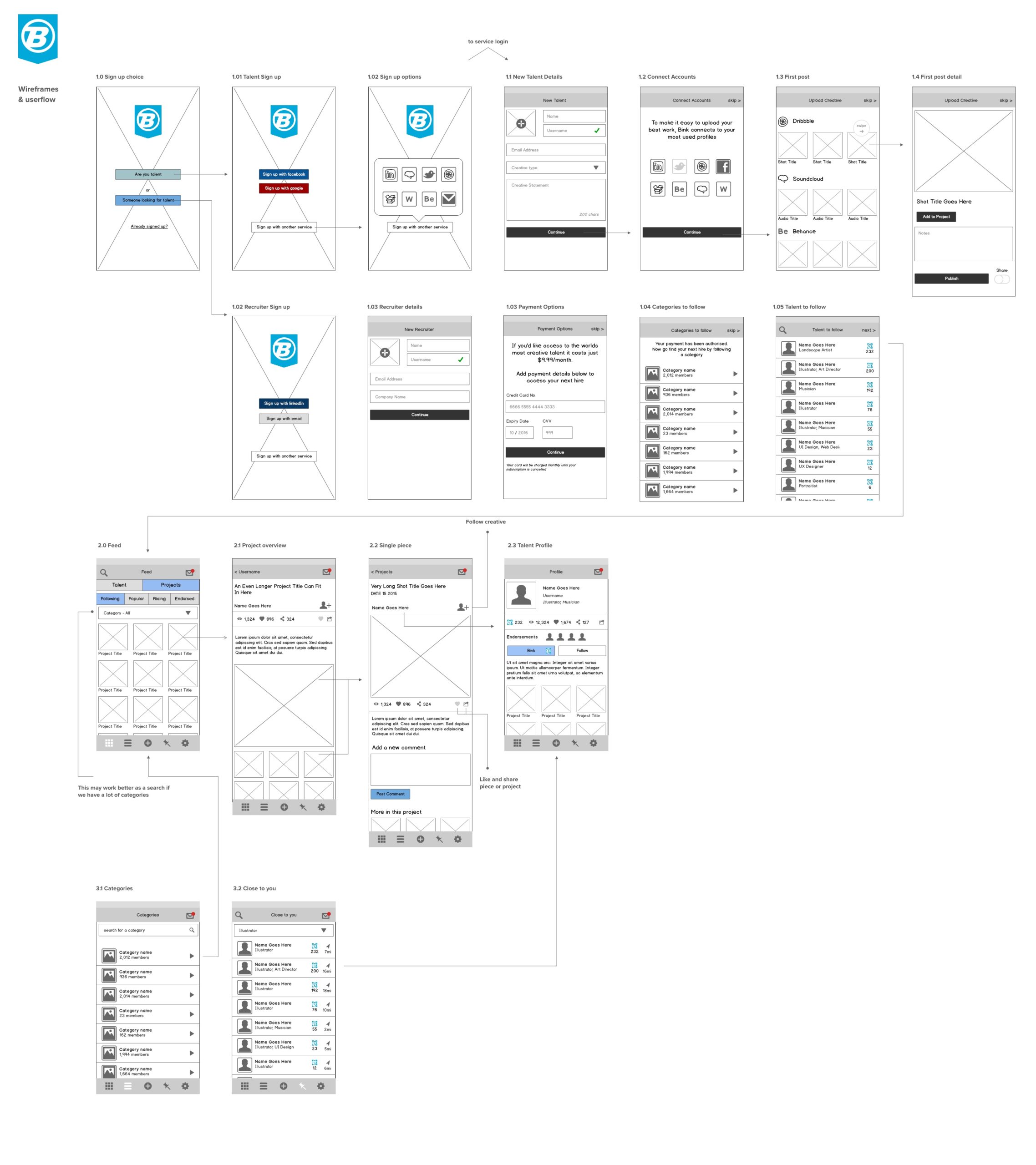
Wireframes
The wireframes showed more defined user flows showing how use of UI elements would both function and guide users through the app. It also gave confirmation that content was correct on each screen.
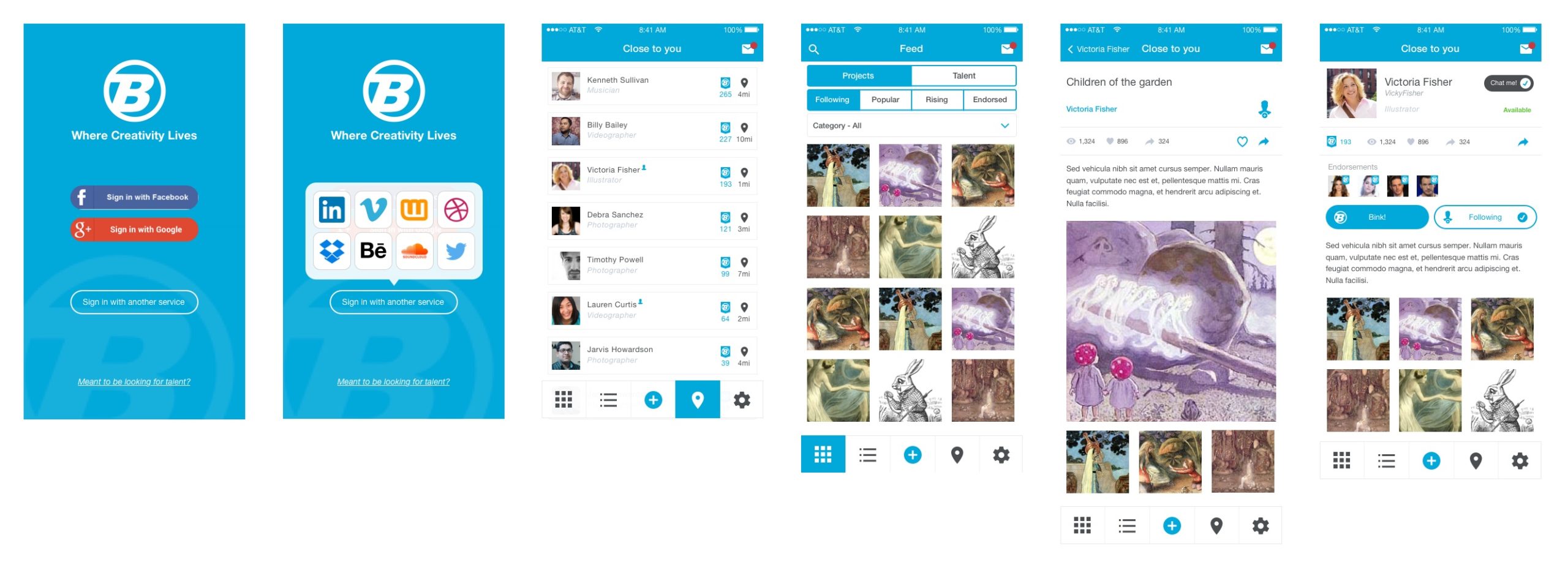
UI Design + prototype
Here are some selected screens from the UI design which was put into inVision to produce a functional prototype to present to potential investors.