Genymotion is the worlds most popular Android emulator. In late 2015, they approached Clevertech with an aggressive timeline to redesign and build their user-facing website in 3 months.
What I did
Initially we had a discovery meeting to learn about the company, it’s needs and goals for the site and to gain data insight with some analytics. Their KPI’s included free and premium downloads, and decreasing drop-outs from their checkout flow.
As PM and design lead on the Clevertech side, I ran an agile team having daily stand-ups with 3 engineers ensuring everyone was on the same page and blocker-free throughout the project. We also met daily with the Paris-based Genymotion team to give updates on progress and to deal with any issues.
The work
We planned out the new site with the Genymotion team in terms of structure, content and functionality focusing on the top user and business goals. As their team got going with writing the content, we were able to start building out some of the functionality.
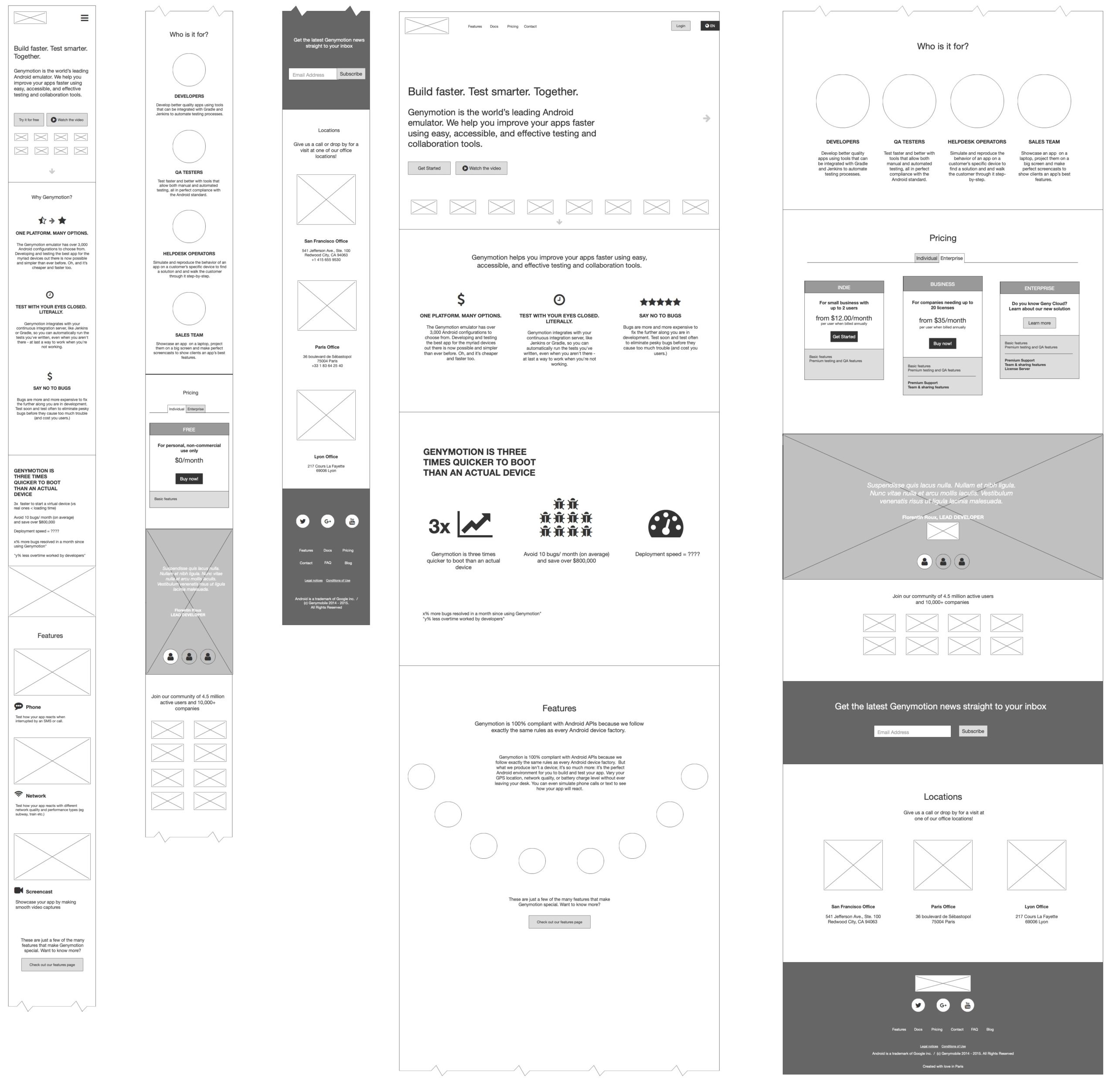
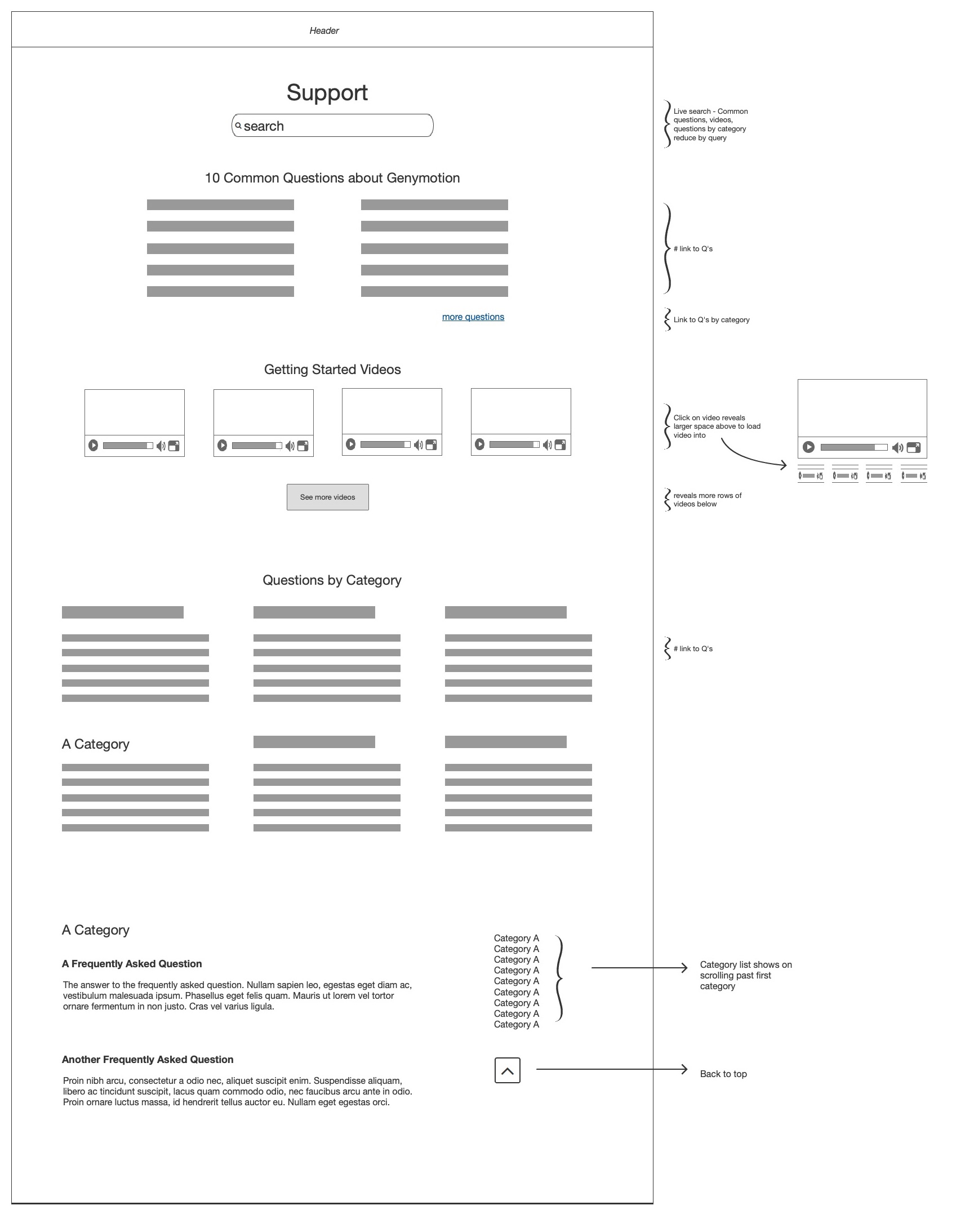
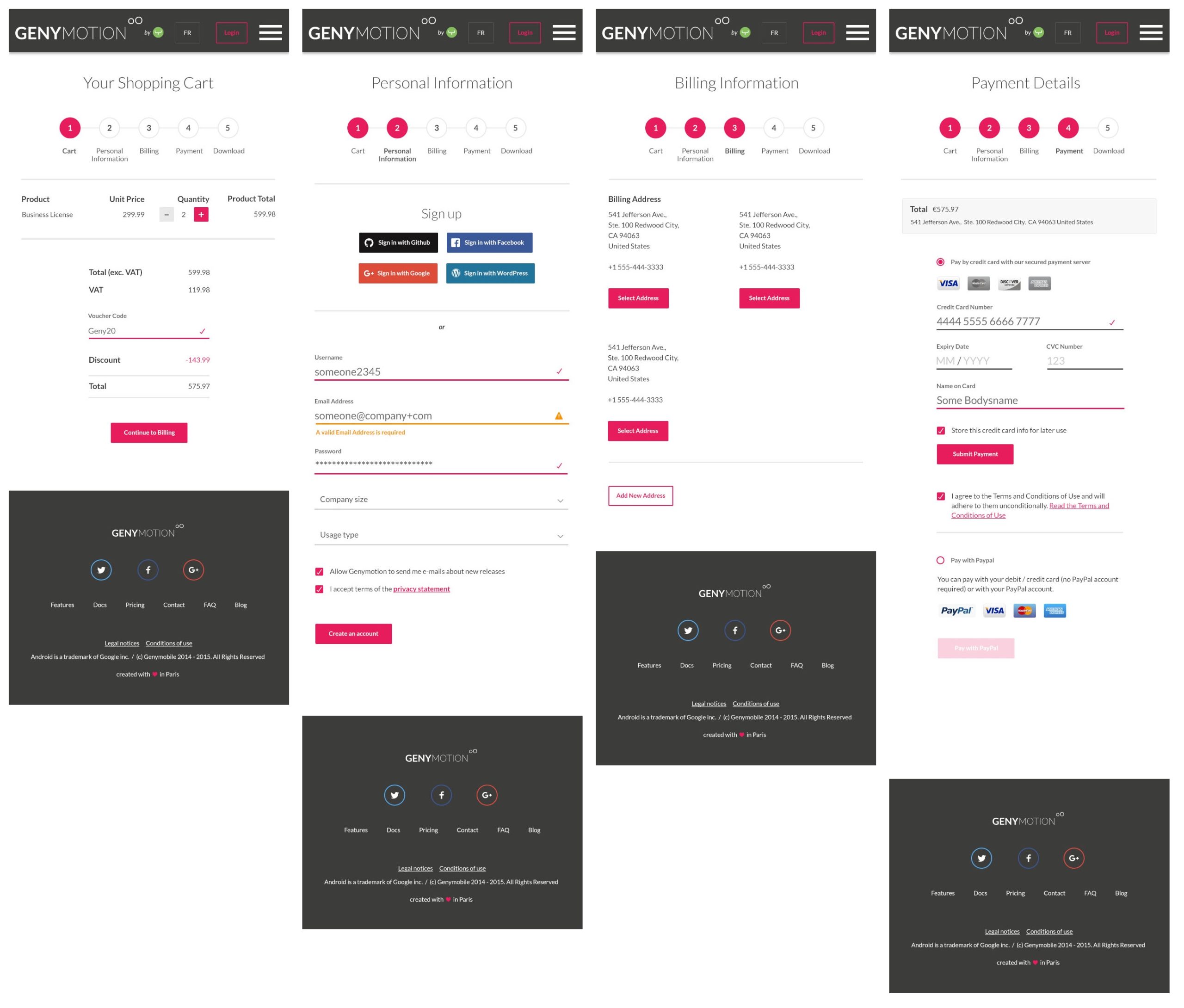
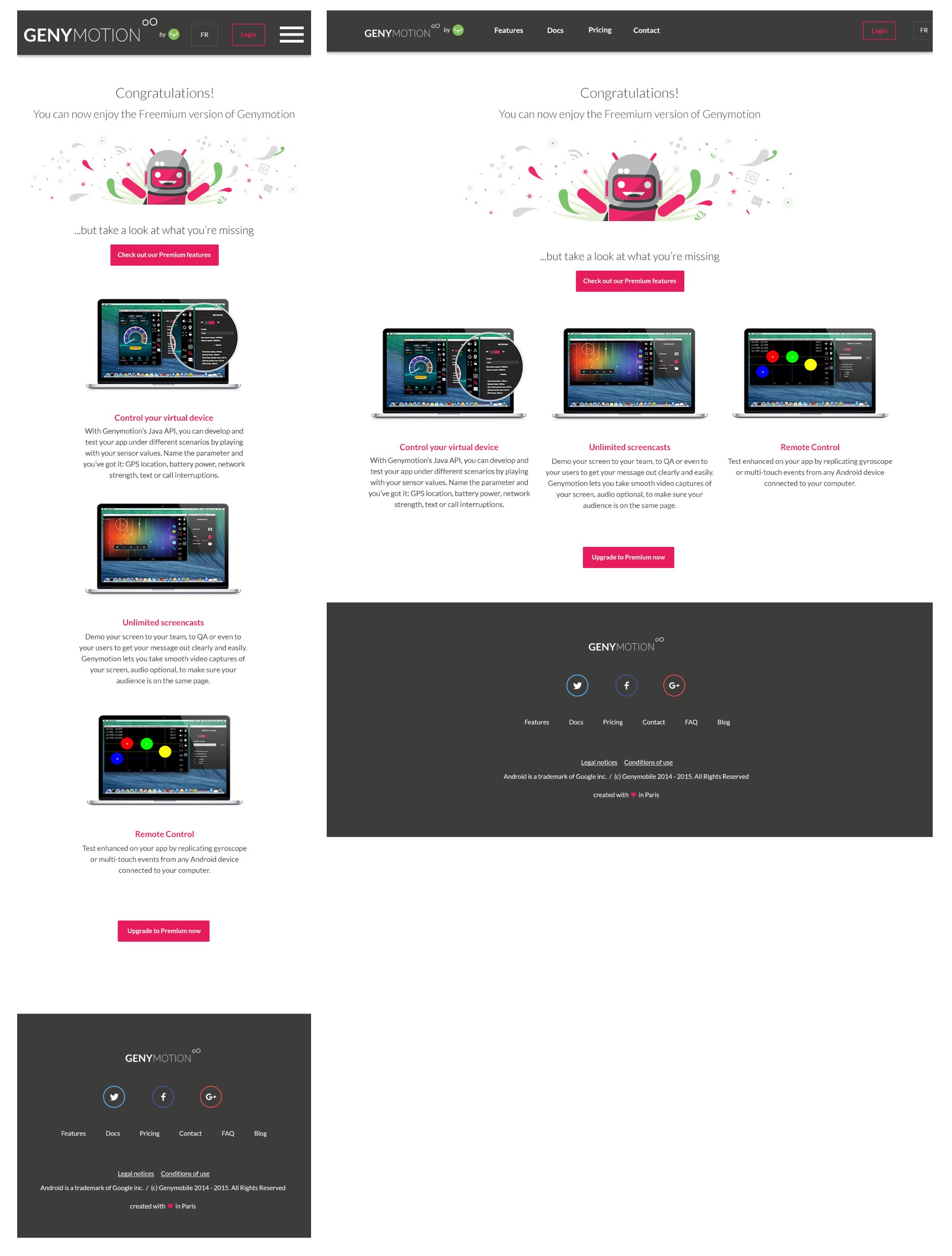
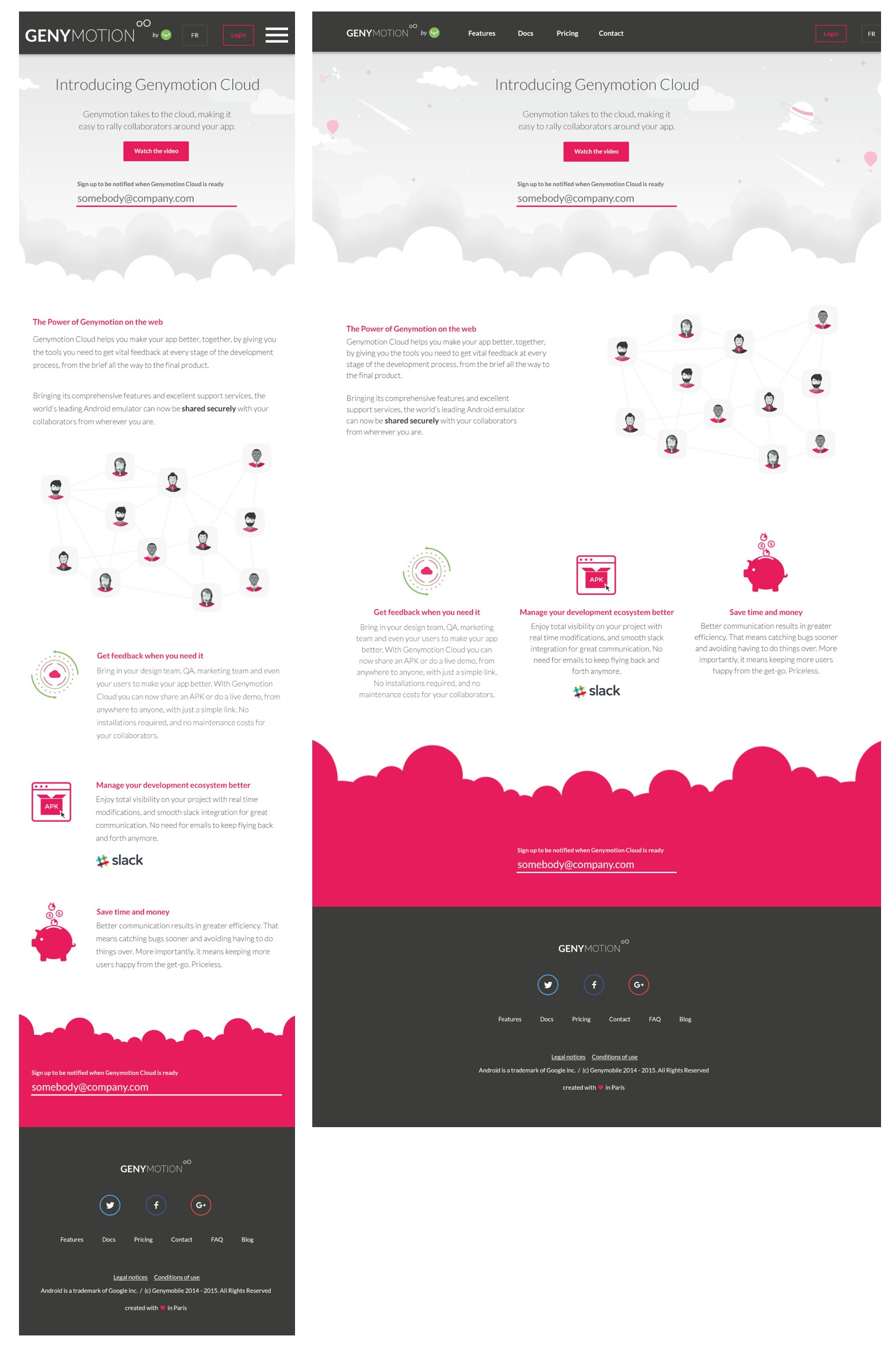
Once content was ready, I designed the user-flows, wireframes and UI for both mobile and desktop. Below are a selection of wireframes and UI from the project.
Success
Once the site was launched, our involvement in the project was over. I can assume that the site improved KPI’s as in 2020 it is almost untouched in terms of design and userflow.
