The following are independent ideas, or pitches that were not selected for implementation.
Project 1
Student Job Board
The problem
At UBC, there is no centralised job board. Students have to go to independent department and faculty websites depending on the type of work they are looking for. This job board aggregates all jobs types across the different platforms. After initial research, it was deemed too large a project to accomplish with the existing infrastructure.
Wireframes
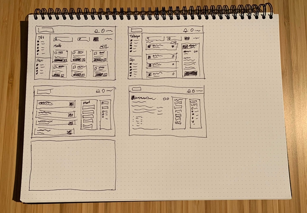
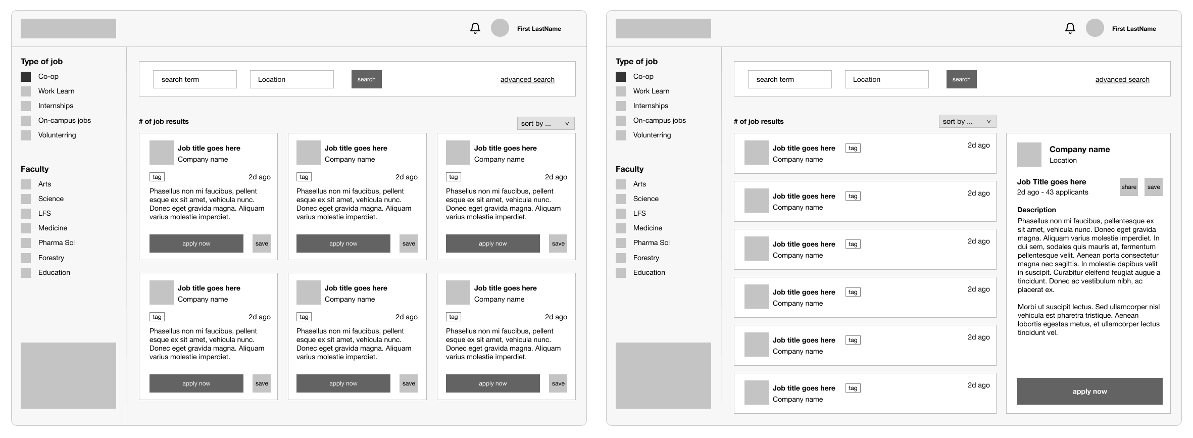
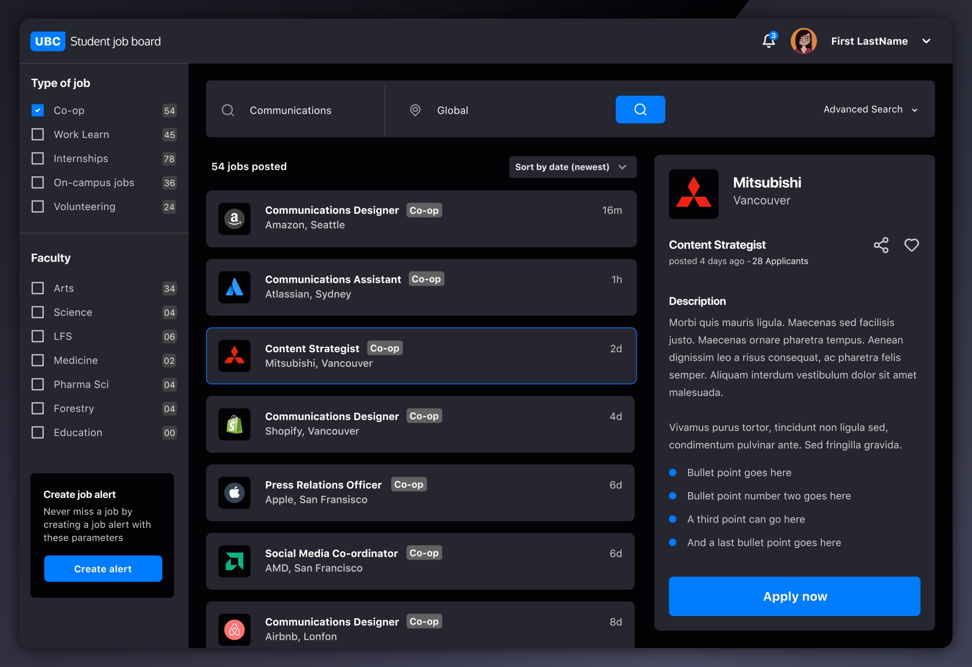
I tried a few different layouts to display the large amounts of information needed for students to focus in on what they are looking for. I decided on the following as it was the least confusing and enables expansion of content without compromising usability.
I designed two search mechanisms which integrate with each other, to cover as many use cases as possible.
User Interface
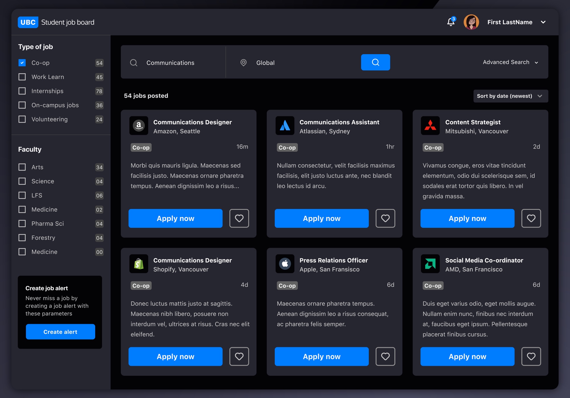
I decided on a dark UI, with the option for a light mode in the users’ account settings. Clear primary and secondary cta’s (applying and saving) were designed and I added some useful components that weren’t in the wireframes.
Project 2
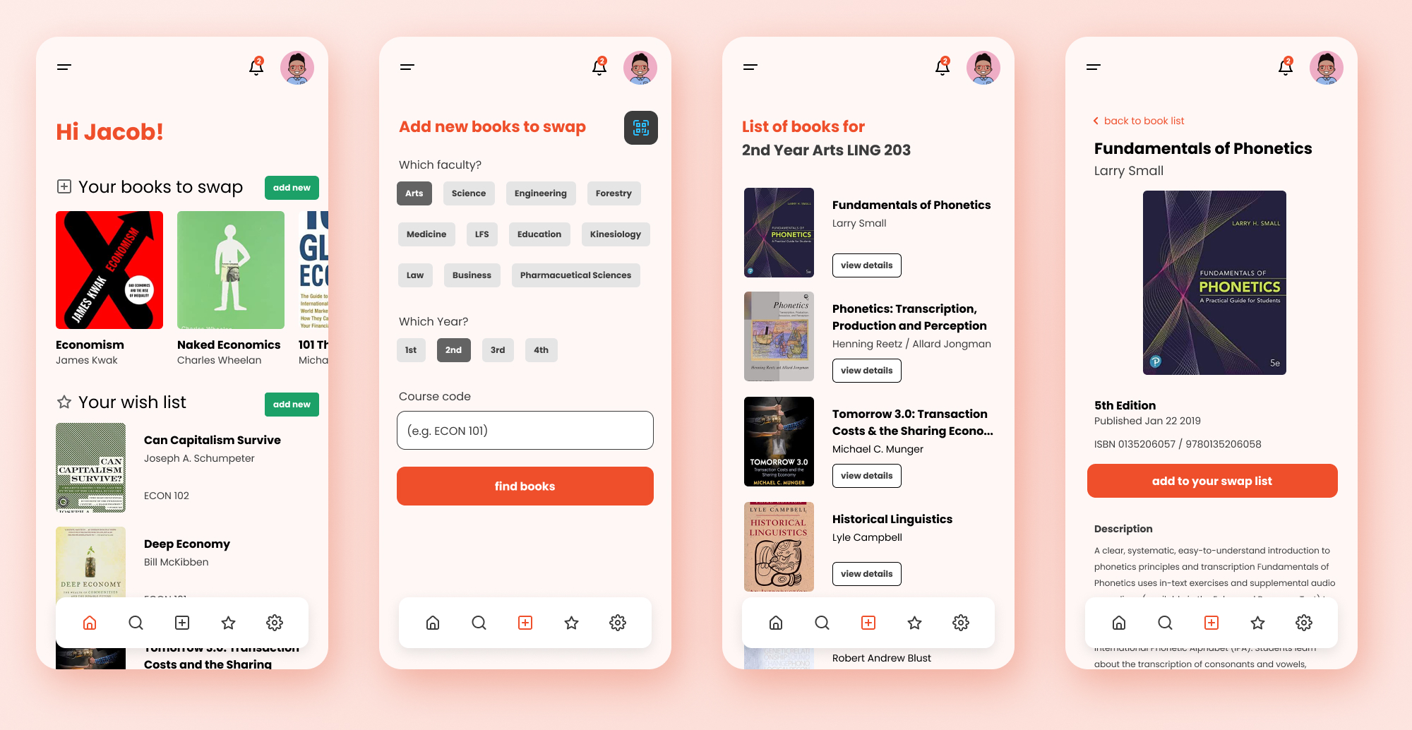
Text Book Swap App
The problem
Students face increasing costs when attending University. Text books costs are spiraling, and this platform matches students for past and future courses, and enables them to swap text books, therefore reducing these costs.
Content and user flow
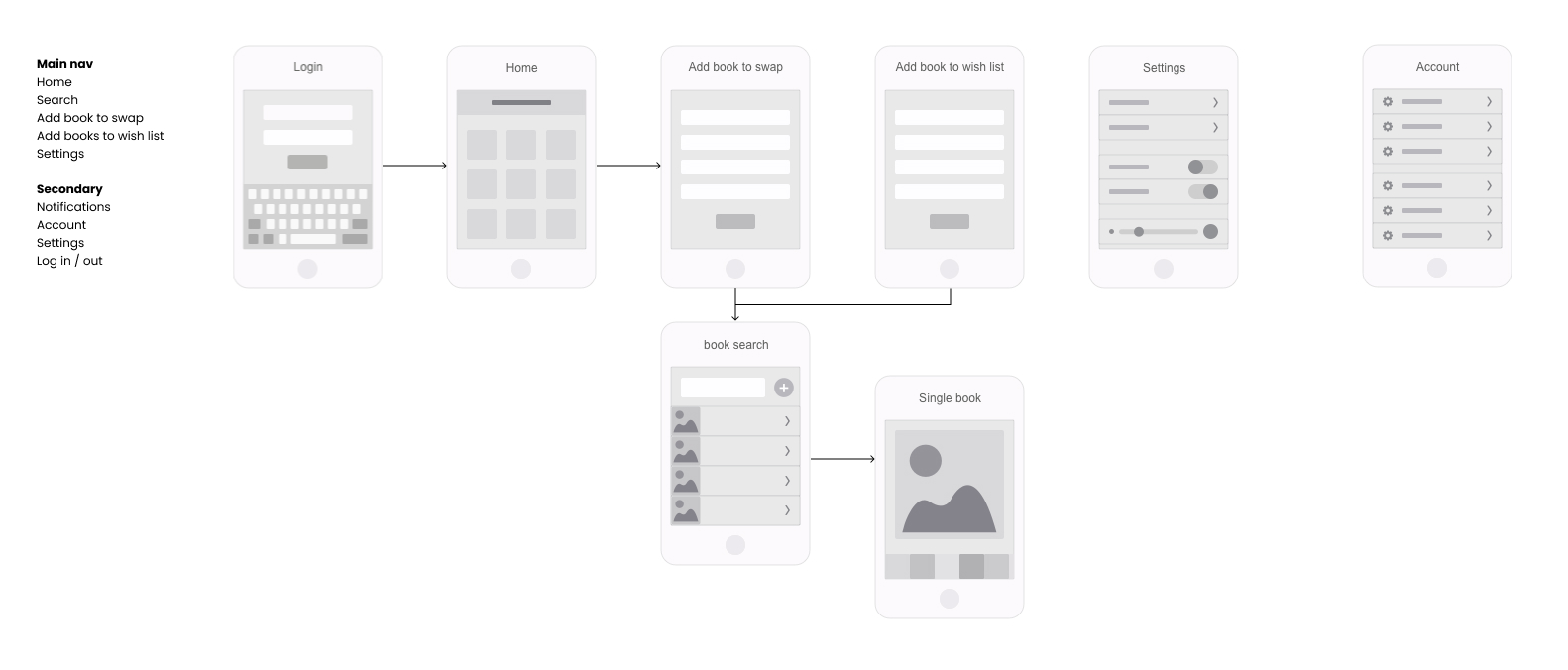
The minimum usable product was defined as below with a roadmap to build out additional features. Students would use their campus login to enable a seamless integration with any future university products
Wireframes
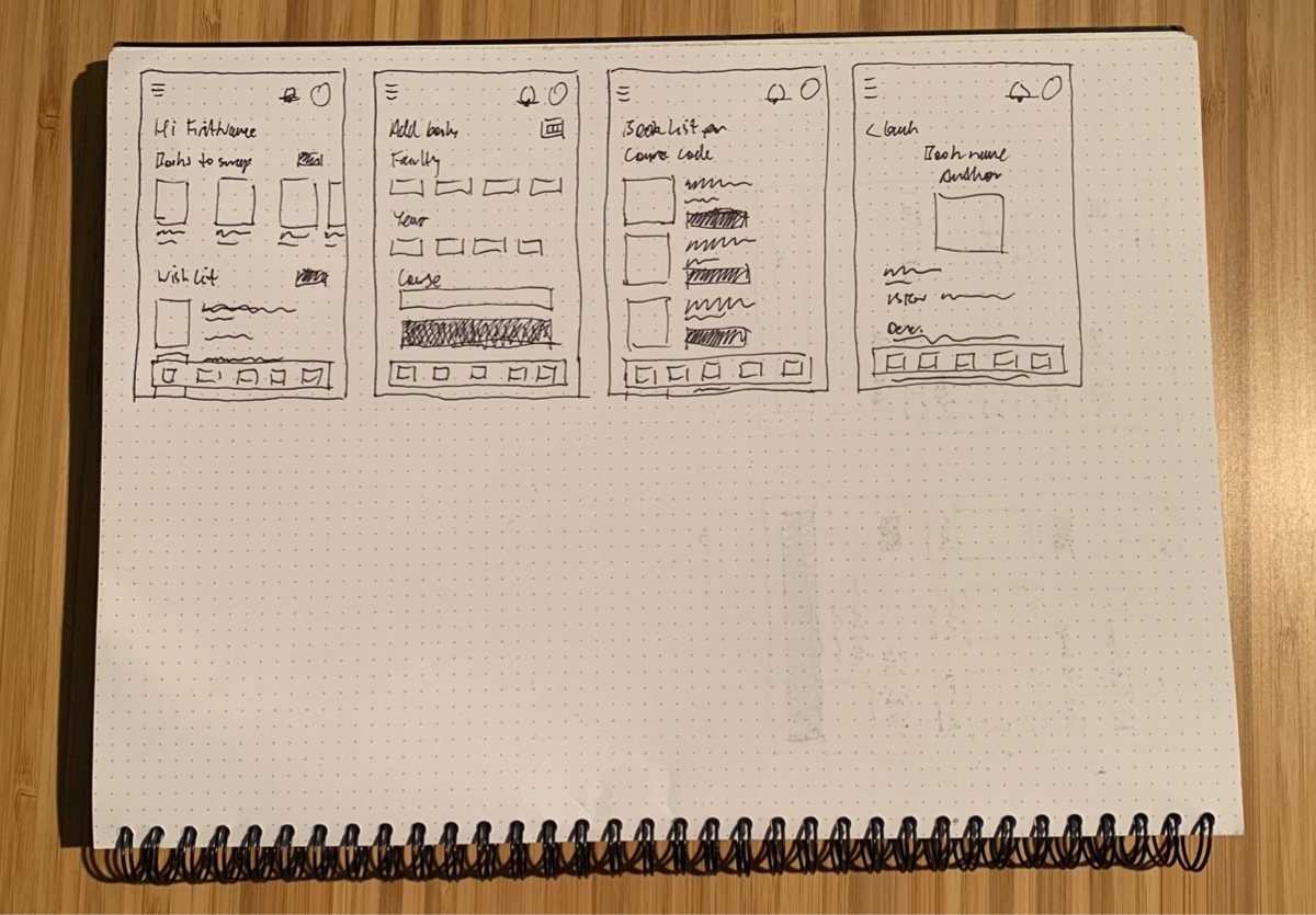
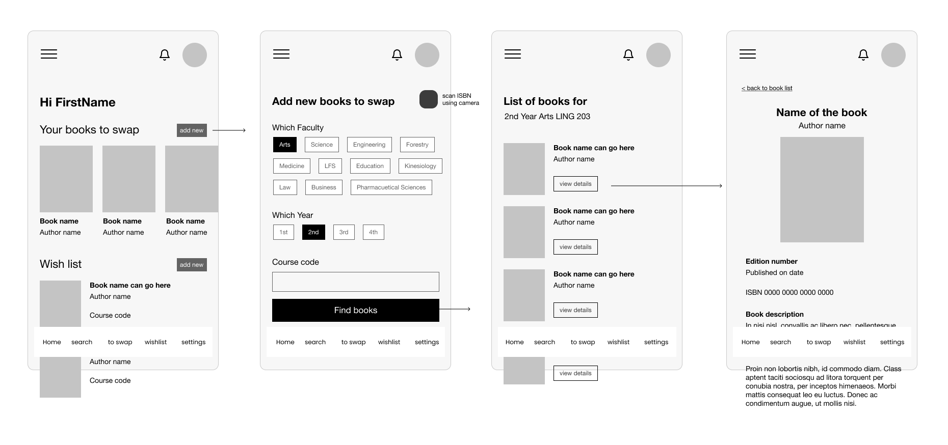
Here I added content hierarchy and cta’s to focus the users attention on the main intentional tasks.
User Interface
I decided on a clean final UI with a strong typographic hierarchy, elevating the imagery and calls to action.
