Plated was a New York based food prep and delivery service which was founded in 2012. After being acquired by Albertsons in 2017 for $200m.
What I did
In January 2015 I was integrated into the Plated product team with the main task of simplifying their checkout flow and increasing conversion rates—one of their main KPI’s. I also worked on user-flows and UI design of other key landing pages to add a more personal experience to the overall user-journey.
We were able to monitor the changes that were made to the UI and then split tested and iterated on the most successful.
Skills / Software
- Discovery & Design workshops
- Iterative design process
- Wire-framing
- UI design
- A/B testing
- Checkout optimisation
- Sketch
Discovery
I held discovery meetings with the product manager and design team to understand business and user goals, and what had been tried previously. We also defined success metrics.
Develop
With 3 designers having responsibility for separate areas of the product, we each held design workshops to generate as many ideas as possible. Each workshop included all designers, the PM and engineering. Each designer was then accountable for which ideas were integrated and how.
Deliver
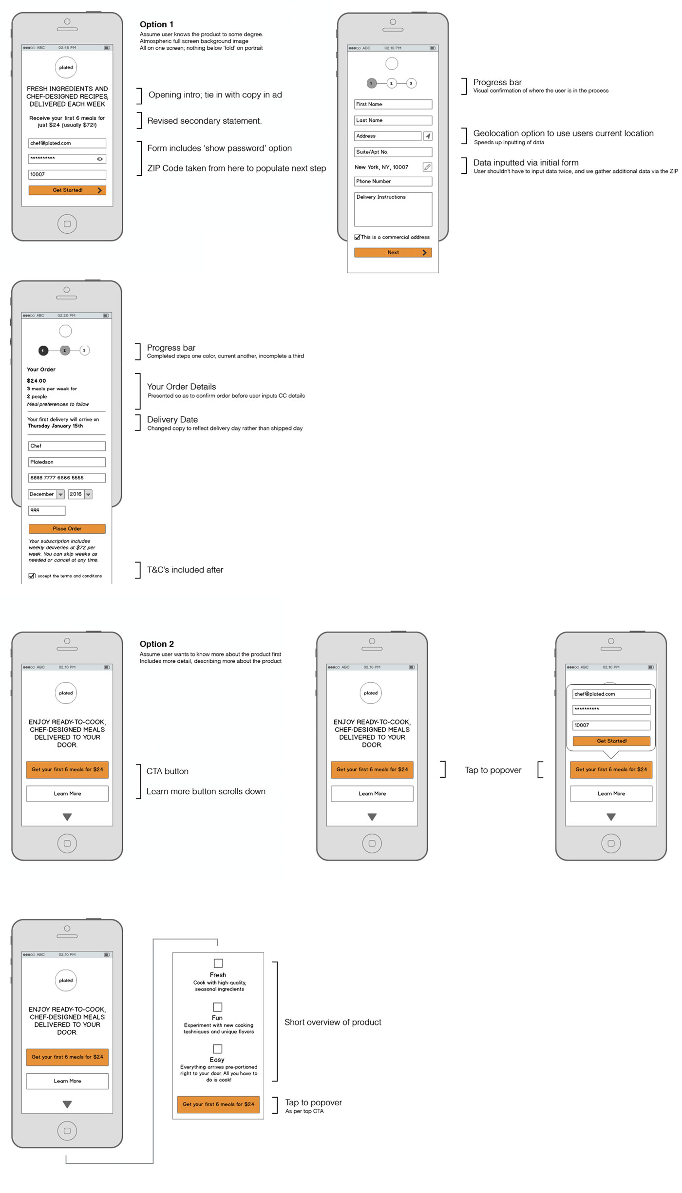
Starting with mobile, I was asked to re-imagine how the checkout flow could work. In the wireframes, I introduced a couple of new pieces of technology which would be quick to implement, decrease drop-offs and enhance the users experience. Adding these to the wireframes enabled the engineering team to start development whilst designs were being finalised.
We ran A/B and multi-variate testing with each of the following to understand how they affected our KPI.
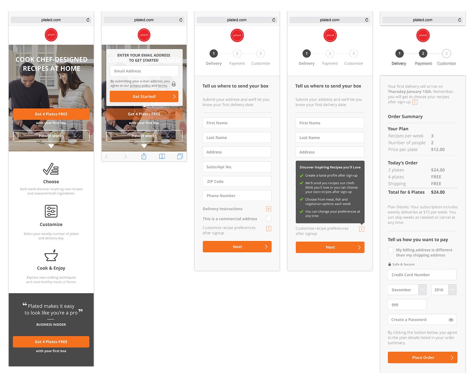
Firstly, because Plated only delivered in select states, the zip code of the user had to be validated as a first step; when this returned true, it was then used to populate fields in the next section of the form.
I also suggested adding a progress bar as providing visual confirmation to users of where they are in the journey has been proven to increase conversion.
The UI design was largely based on existing brand guidelines, but I was able to introduced a standardized input field design for text and dates, and included a ‘view password’ icon.
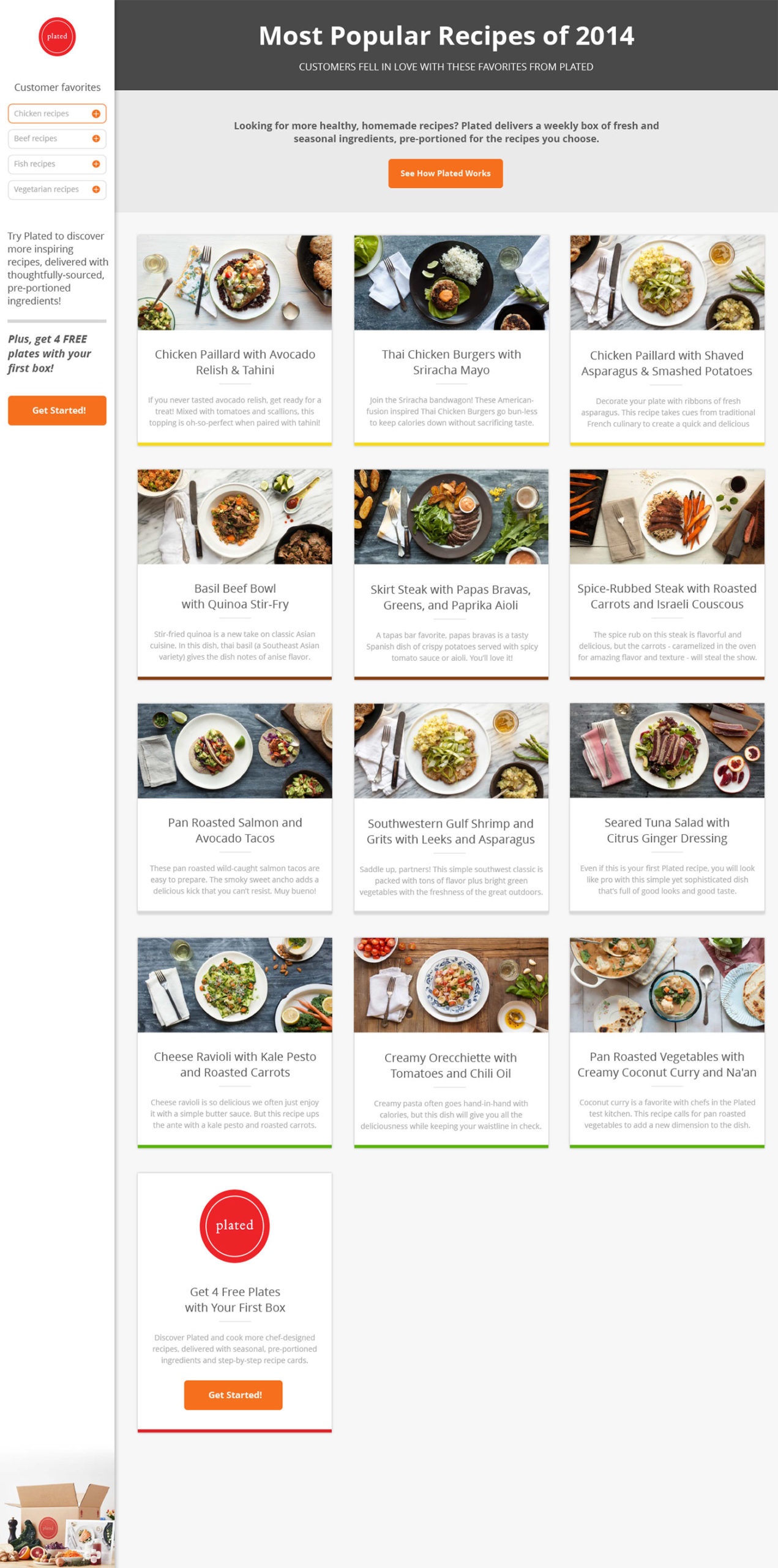
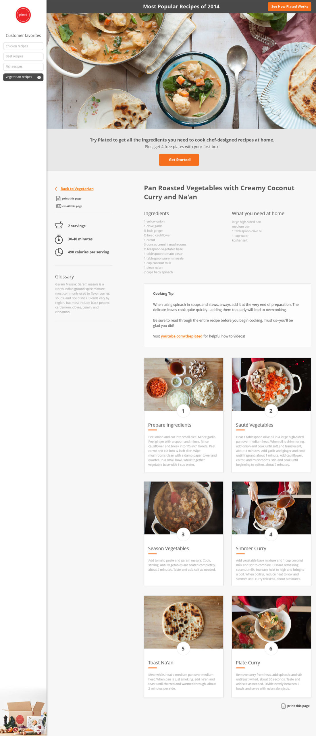
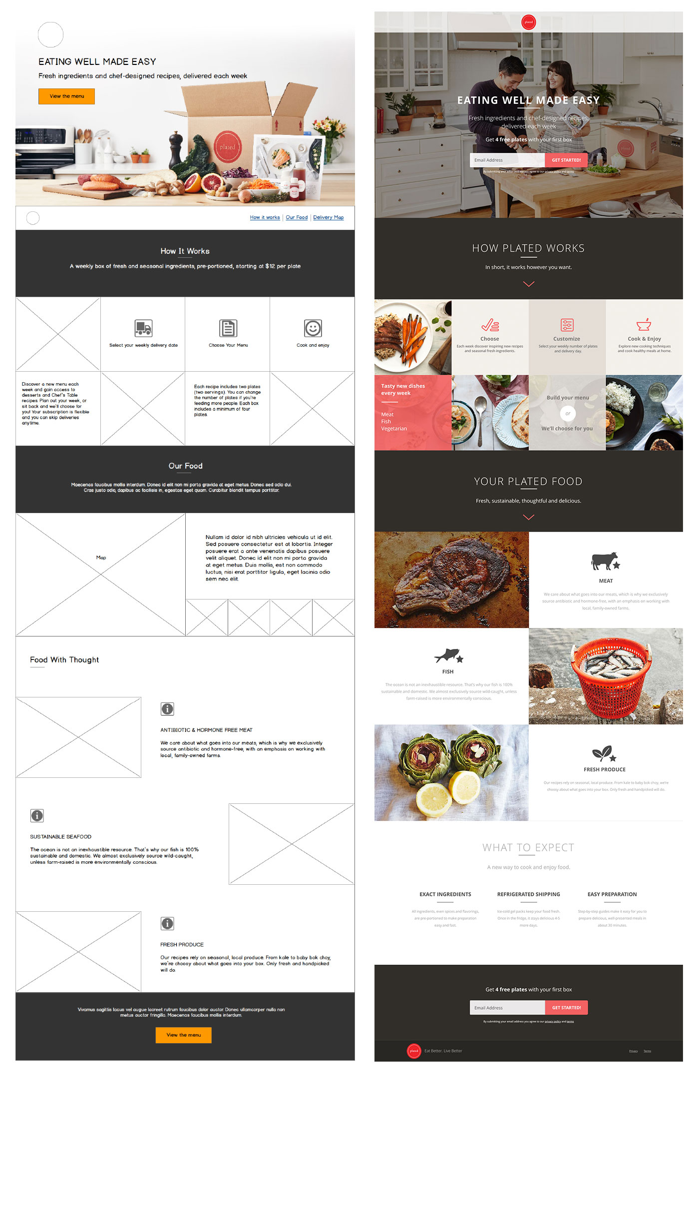
I was also tasked with designing a recipe microsite that would provide information of Plated’s meals and drive traffic to the main site.
Success
The team saw an increase in conversion rates from 1.4 to 2.9% over my four month stay which, in part, enabled them to bring on 4 more designers to focus on other areas of the site.
