The Business
Tiltify is a unique industry-leading fundraising platform, initially built for online streamers from Twitch, YouTube and Mixer. We build innovative tools to help fundraisers raise more money for their chosen charity, and help charities understand more about their fundraisers and donors.
My role
I joined Tiltify as their first hire in 2015, and have been with the company as they have transitioned from start-up to growth stage.
I work across the the entire platform, collaborating with the engineering, marketing and charity success teams on both the product and directly with charities in building out their fundraising programs.
Working collaboratively with the engineering team we design and build iteratively based on own internal analytics and feedback from users.
With the front-end engineering team, we’re continually evolving a robust design system in Figma and React which means we’re able to design and build quickly and consistently for users.
Skills / Software
- Data informed design + user research
- User flows
- Card sorting
- Engineering collaboration
- Figma
- Design systems
- UI design
- Prototyping
- HTML/CSS/JS
Feature study
Hadouken Design System
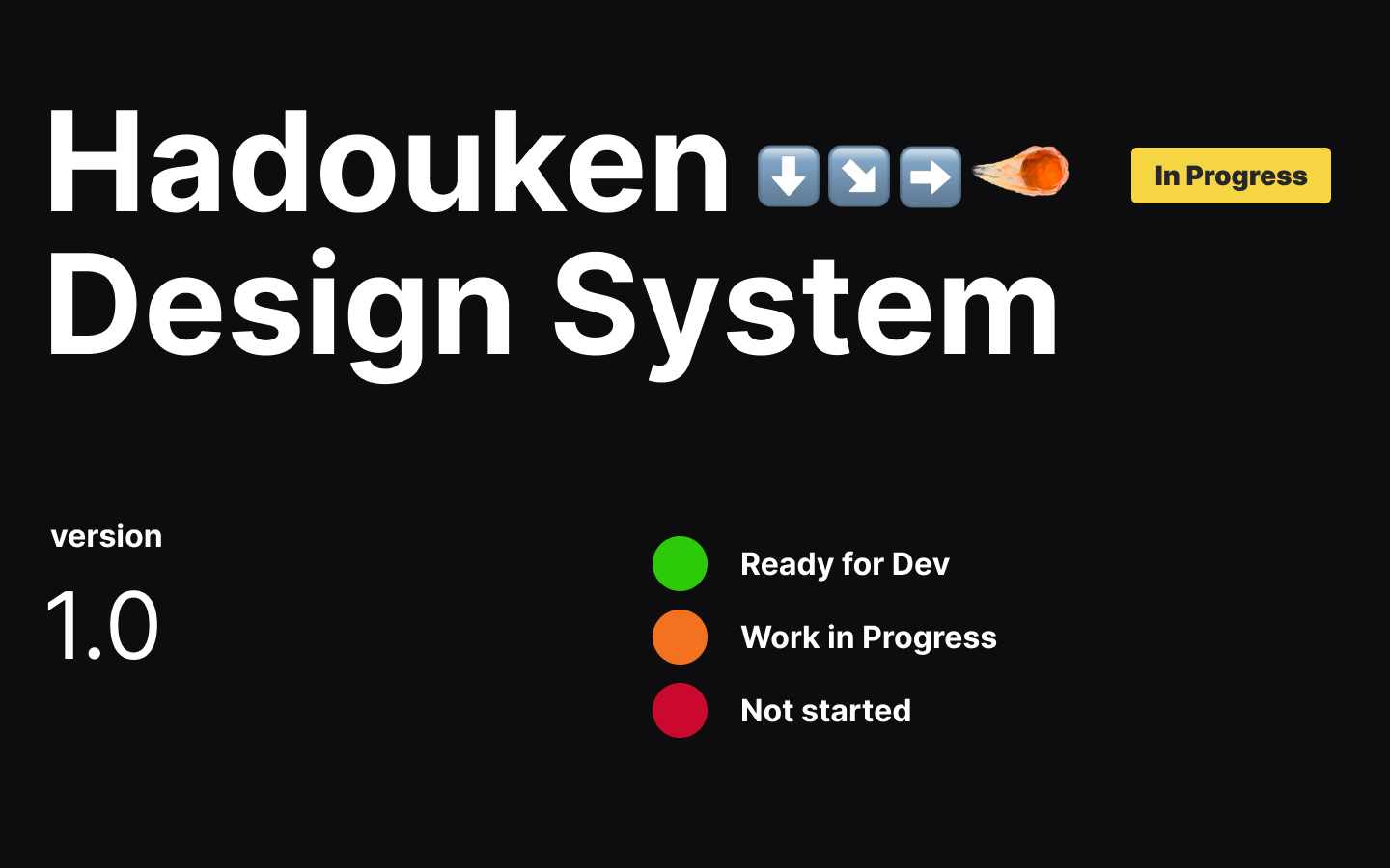
Over the previous 5 years, I had designed multiple admins for both fundraiser and charity, as well as the marketing side of Tiltify. Keeping these up to date and consistent had become a huge task on its own. When I started full-time in 2021, I undertook the task of consolidating our UI with the aim of a single unified system that had one source of truth.
Built from scratch in Figma and continually evolving, Hadouken has enabled us to design and build consistent and accessible experiences quickly and solidly. In addition to our core system, we have an add-on system for Marketing (named Vega), which takes Hadouken as its base and expands our color palette and typography to enable creativity on digital marketing assets.
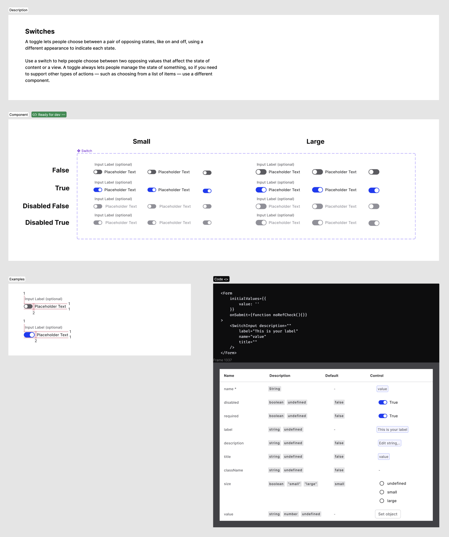
Each components page has a number of elements:
- Documentation to enable both designers and developers to choose the correct component for use
- Designs for all states that we need
- Examples using our spacing variables
- In collaboration with our front-end engineering team, React code examples with variables and properties
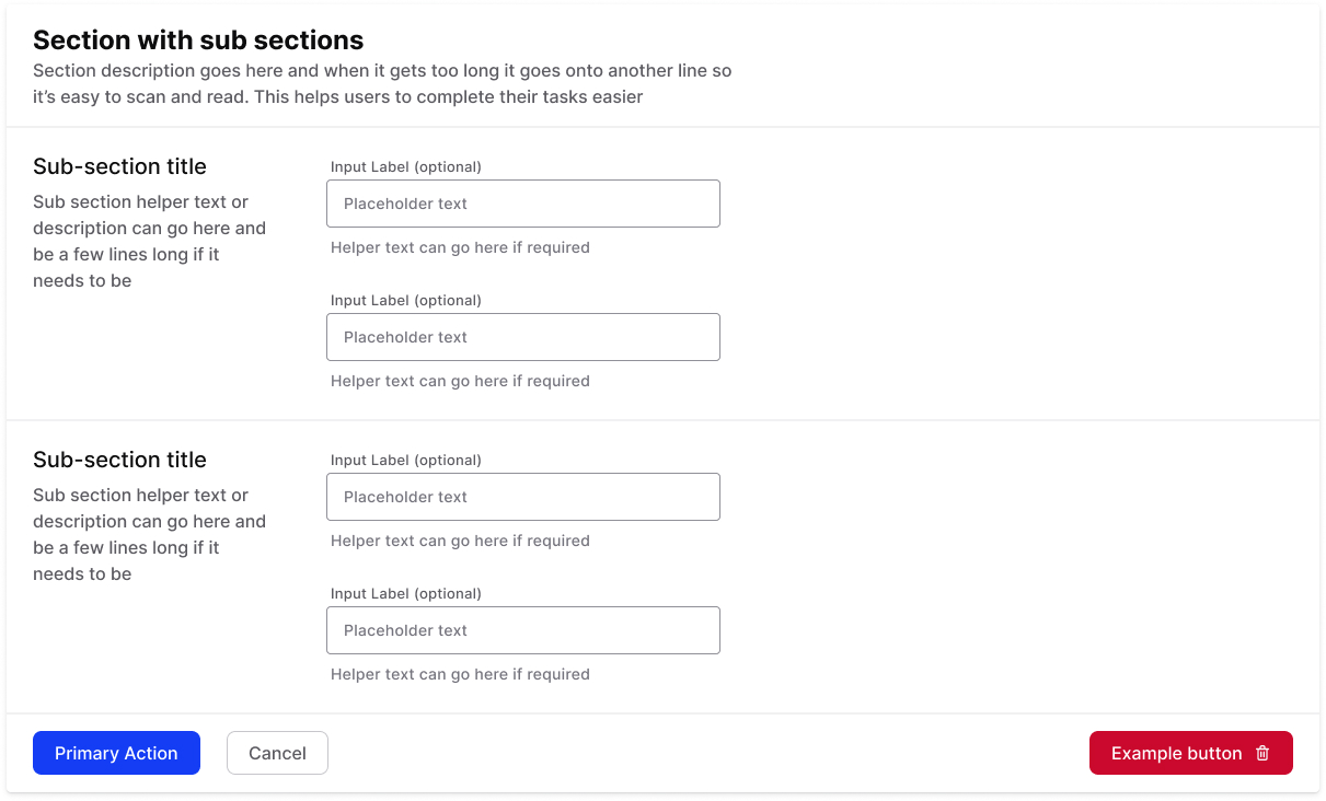
As well as individual components, I’ve built out common layout examples and documentation on how to use groups of components together.
We continue to build upon the first few years work, and are slowly converting all of our components to use tokens and variables.
Feature study
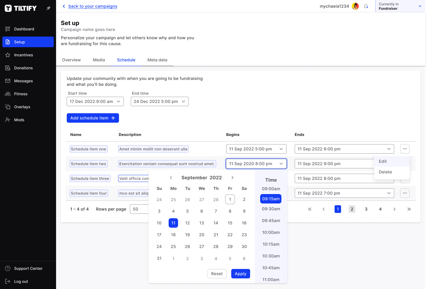
Donation flow
Problem
As we went into growth stage in 2018, and with two new engineers on board, a lot of features were being introduced that were simply added to our donation flow. The flow had been added to organically as these features were implemented, and had become too complex and confusing to users. We also weren’t able to test with users before deployment at that time.
Our goals
Business goals
- Reduce drop-offs throughout the flow
- Ability to integrate with external vendors
User goals
- Keep the donation flow simple and quick where possible
- Allow donors to see their options through the flow
KPI’s
- Avg time through donation flow
- Drop-off percentage
- No. of support tickets from donors
Understanding technical process
The CTO, engineers and I ran through flow and constraints; with multiple donation methods (PayPal, Stripe, Amazon Pay etc) it was important for me to understand what I was designing around.
High level decision
In this conversation we decided as a team to move the donation flow to a single page, where before it had been a modal. This would help with our business goal of being able to integrate with external partners, and also had the added benefit of allowing users to concentrate on their task of donating.
Alignment on content/technical needs
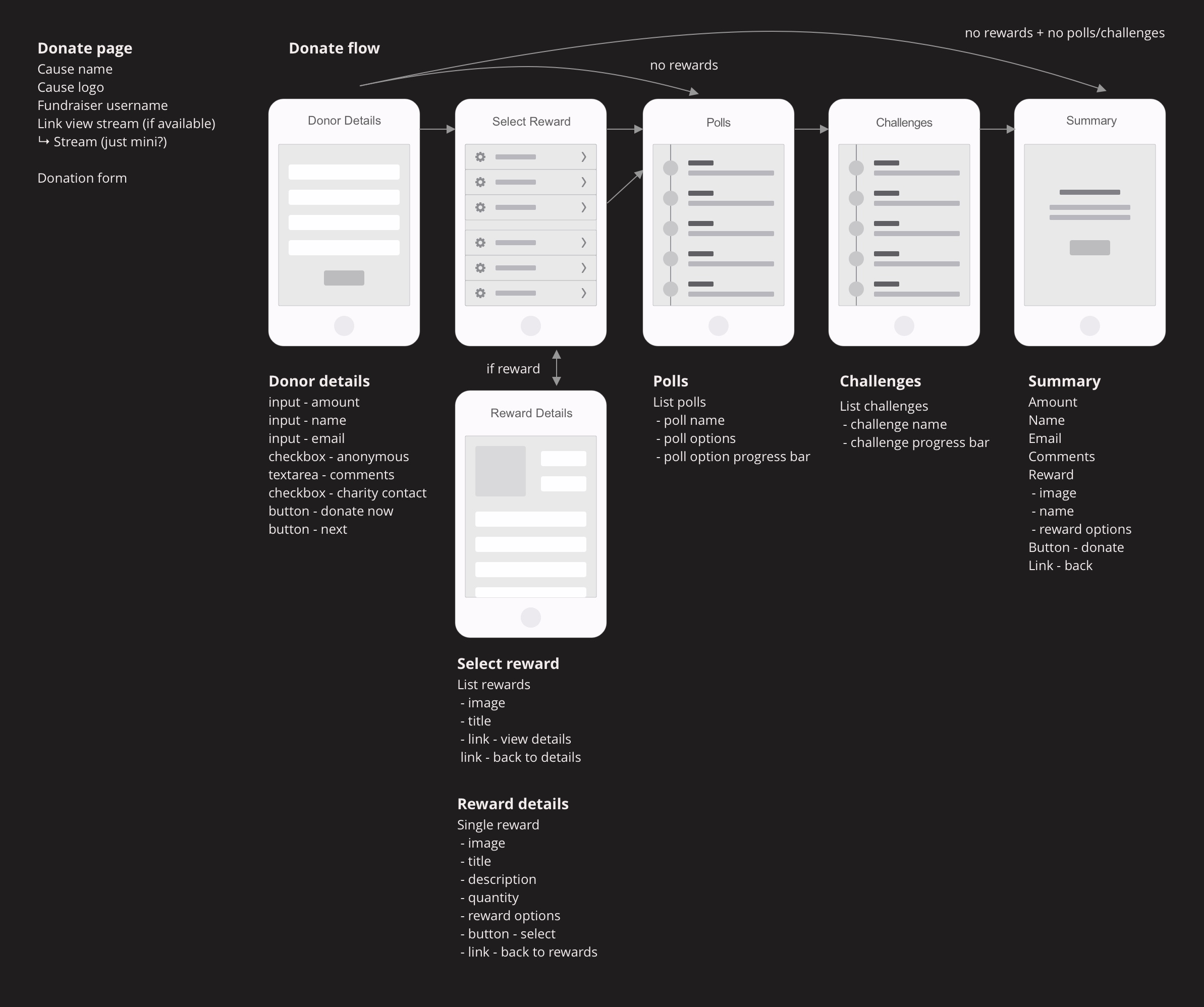
I took a content inventory to see what was needed at each stage of the donation flow. I then liaised with our front-end engineers on the following design decisions:
- Our previous flow had a choose-a-path flow to integrate the various options. Here, I decided to change this to a linear flow
- I also introduced an intentional skip, allowing users who didn’t want the extra options, to just donate in out two-step process
UI design
Because of timelines and that we’d built out our design system to a reasonable level, I skipped wireframes and went straight into UI. Because we’d moved to a linear flow, I was able to introduce visual steps, which from previous experience knew improved conversion. I also made much visually stronger CTA’s enabling users to have a clearer path.
I then built out interactions in HTML/CSS/JS, and this was also the time we introduced our dark mode. All of this was tested against the WCAG2 accessibility guidelines and passed at AA, with some elements at AAA.
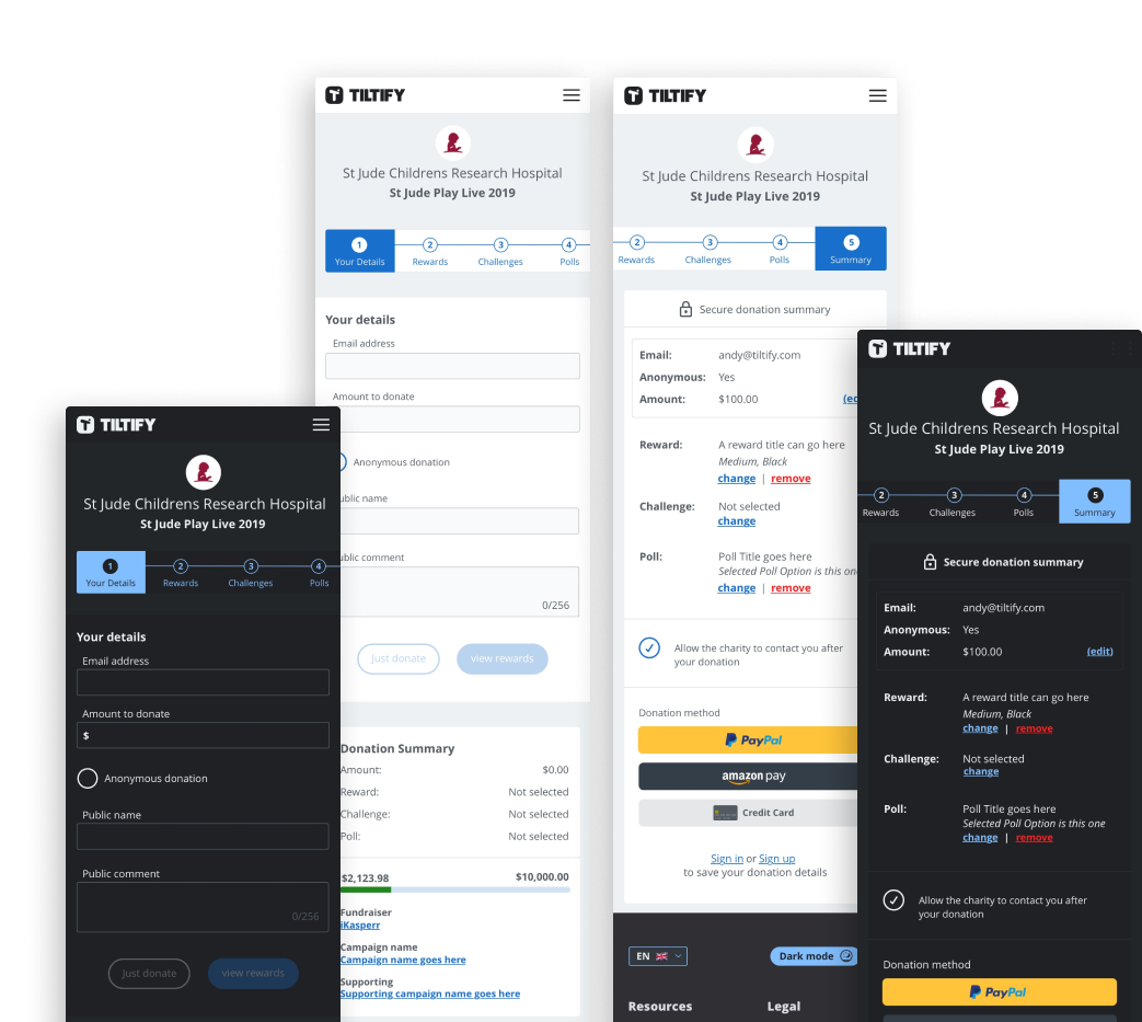
User Testing
Through our charity success team (who are users of the platform), we were able to get rounds of testing and feedback. Chosen feedback was implemented, tested again in the same environment, and then pushed to production.
Results (numbers redacted)
Business goals
- Significant increase in completed ‘complex’ donations
- Small increase in basic donations to completion
- Twitch & Tiktok integration launched 2019/2020
User goals
- Kept donating simple and quick where possible
- Allowed donors to see their options throughout the flow
KPI’s
- Basic average donation time is down
- Drop-off percentage is down
- Complex donation support tickets are significantly down