Practicing the craft of UI design is an important aspect of my work. It’s not always possible to be on the cutting edge with established products, so this small playground helps me expand my UI design skillset, using real-world examples. All of the following were produced using Figma.
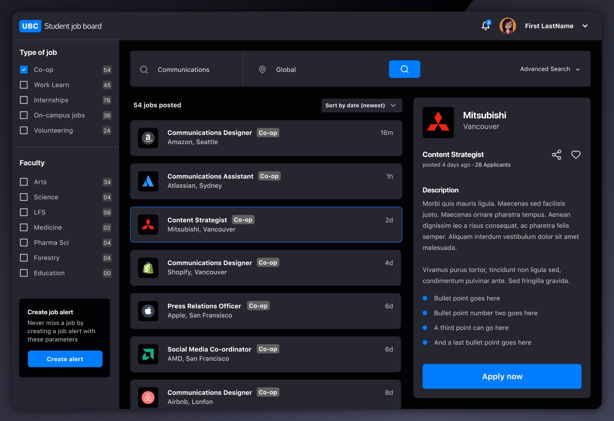
A project which was needed, but never prioritised at UBC was for a centralized job board for students. After doing planning and research, it seemed a shame for it all to go to waste so I put together a UI for it.

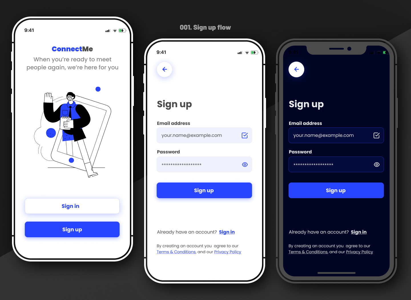
A sign-up flow with light and dark mode for a fictional app helping people to meet together again after the pandemic. Includes two main calls to action and modern typography.

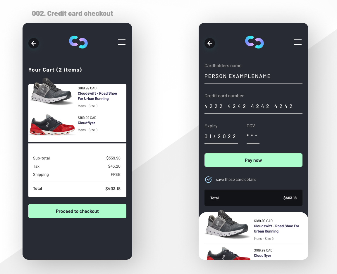
Checkout and credit card input screens for an online store. Call to action is clear and highlighted, with information the user needs to be confident what they are purchasing.

